
What you don’t know can hurt you, so here are five pro tips to help your ads stand out.
Who needs to pay for professionals when you have a fully functional copy of Microsoft Word, am I right? It’s not like design really matters, and you already had to pay so much for that ad space!
I’m being facetious here, but the truth is that sometimes you can get away with a touch of bad or amateur design. Specifically, if you deal with commodity-based products, and all that matters is showing that yours is the best price, then sure, Word it up.
However, if your business is like most of our clients’ businesses, you probably have competitors that you want to stand out from. You could be like No Name Brand and intentionally stand out as cheaper, but most prefer to have a unique sales proposition that delivers value in other ways like quality, responsiveness, or innovation.
I always like to provide value, and I want to ensure that our free advice is better than other competitors’ paid advice. So get ready to take notes, friend. I’m going to tell you five professional tips that, if followed, will help you design something that looks like you paid us to make it.

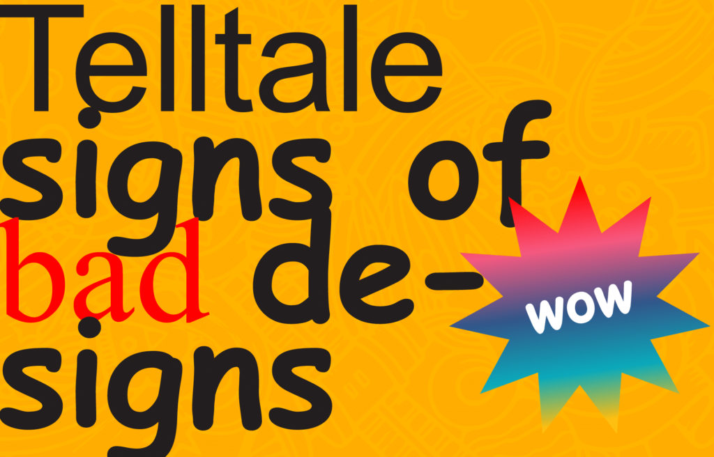
As a focus for this short lesson, I’ve provided a truly terrifying sample ad that demonstrates a litany of common design missteps. I’ll highlight all of the mistakes and detail how to avoid them.
MISTAKE 1

“Make my logo bigger.”
I can count on one finger the number of times a logo was too small in an ad we designed. However, if I had a hundred dollars for every time I was asked to make a logo bigger, I probably wouldn’t be writing this. I’d be in Tahiti, perhaps (I hear it’s a magical place).
In our amateur example, not only is the logo way bigger than necessary, it has also been squished to make it fit the space. Never do this, please. Altering the shape of your brandmark (which is my preferred terminology for your company’s visual identity marker) compromises its integrity, and makes your brand appear Mickey Mouse (which is an ironic term considering that the Mickey Mouse character is an iconic brand unto itself, but you know where we were going with it).
HOW TO AVOID THIS MISTAKE
Simple. Display confidence in your brand. Having your brandmark at a modest but legible size will demonstrate that this company is successful enough that you should already recognize the brandmark. Have it near the bottom unless your advertisement IS your brandmark (ex. A hockey rink ad). Provide ample space around it (more on that later) and for goodness’ sake, please ensure that it isn’t stretched or squished!
MISTAKE 2

“Make it pop.”
All too often we see in-your-face gradients, starbursts, and busy illustrations that don’t make any sense. Yes, it’ll certainly be noticeable, but at the expense of your brand credibility. I repeat: if you don’t bring value exclusively by being cheap, then don’t use design elements that cheapen your brand.
How to avoid this mistake
Use colour very intentionally. Solid background colours, light patterns or textures, and subtle gradients (in the nasty example, it goes all the way from red to blue, and looks terrible. Try a gradient from red to orange, or indigo to purple!), will help your content stand out without stealing the show. It’s a background, not the main event!
And while we’re on the topic of colours, unless you’re marketing with a rainbow, or you have an add for skittles, try to keep your colour palette to black and white plus 1-3. It’s an ad, not a rave.
Unless you have a 60% off sale on your item, avoid using starbursts. They are synonymous with the word cheap. Instead, try using a sidebar if you have additional content to add. But, only if you have to–which brings me to the next mistake.
MISTAKE 3

“Tell them everything!”
This happens all the time. People try to get the most bang for their buck by cramming in as much information as possible. Unless you have a grocery or car lot
How to avoid this mistake
Set a goal for your ad. This means that it should serve one objective. If it’s to promote an event, only mention things that pertain to the event. If it’s a product, only promote the product. You don’t need the entire kitchen in your ad. Ideally, you should have a headline that grabs the attention of the right audience, some kind of imagery or additional text that supports the concept, and then a clearly defined call to action below. If you only want people to call you, say “CALL US TODAY AT 555-555-5555”. These days, it’s usually a call to visit your company web page.
So, to be clear: don’t give too many options. The best ads are succinct, engaging, and direct.
MISTAKE 4

“More fonts means more variety, so that must be good, right?”
Wrong. It’s bad. Different typefaces evoke different feelings and meanings. Your font selections are just as important as your colours and imagery. Your headline should convey one thing, and your support text another, even if it’s reiterating or expounding on the headline.
How to avoid this mistake
I recommend sticking with 2-3 typefaces at most whenever possible. The more you add, the more divided your audience’s attention will be. Well executed typography in an ad
MISTAKE 5

“White space is a waste of space”
This is probably the most subtle of the various mistakes, but it matters. In fact, poor use of space is how I can tell most amateur compositions from professional work. Spacing can be screwed up in a number of ways.
- Too much/not enough vertical spacing between lines. Sometimes there is way too much spacing between lines, also called leading (back from the Gutenberg days). Headlines especially should be a little tighter since they will often be large–you don’t want them taking up the entire ad (like our sample). On the flip side, body copy paragraphs should have decent leading to give the eye a rest and not stress it out.
- Being filled with content. I harped on this earlier, but I’ve worked with clients that felt that white space should be treated like real estate. No! Stick to content that achieves your goal, and give your audience’s poor retinas a break!
- Too close to edges and elements. This is the number one way I can spot an amateur who otherwise has other aspects sorted out. Good design is balanced.
How to avoid this mistake
If you already avoid all the other mistakes above when you work on your own stuff, chances are that this may be one that trips you up. That’s ok–this is an aesthetic thing that is subjective. Here are some guidelines:
- MS Word has margins built in for a reason. Open a document with default margin settings and compare to your ad. It’s a little generous, but a good rule of thumb.
- Don’t let text or graphics get too close to your brandmark. Make sure it has enough “breathing room” around it to stand set apart.
- When trying to figure out ideal leading, a good default is this: keep your leading at least 2 pixels greater than your font size. So if your font is 18 px, make your lines spaced 20-24 px apart.
The final word
This is hardly comprehensive, but if you follow these 5 tips, your head should look less like our horrifying sample and more like this:

If, however, you find that your advertisements and branded materials still just aren’t quite hitting the mark, reach out and we’ll be happy to assist.