Nucleus Networks
Illustrating the difference that supercharged support makes

Client Name
Nucleus Networks
Website
yournucleus.ca
Market
Canada
Year
2018-Present
Categories
Managed IT Services
When it comes to IT management, what you need is a team that can supercharge your business.
When we first met Nucleus, they were struggling with aligning their culture and branding. A walk-through their HQ was enough to convince us that they were a tech company with a big personality and their finger on the pulse, but their website wasn’t conveying that same message. We sat down with them to begin to reimagine what connecting the heart of their business with their branding would look like.
Services
Brand Research & Strategy
Brand Development
Graphic Design
Responsive Website Design
Martin / CEO
As a company that supercharges your business, Nucleus wanted a website that better reflected its values and services. The site needed to have:
- A more eye-catching design without losing the integrity of their services,
- A clear reflection of their internal culture, i.e. an injection of fun,
- A brand identity that differentiated them from other IT providers,
- Clearer copy that drove home the value they bring to their clients.
Our initial approach
As a team of creatives, we know that our first draft rarely looks anything like our last, and Nucleus was a great example of this. After working on a couple of concepts, we knew we just weren’t hitting the wow factor. Rather than give up, we decided to sit back down and look at what we might do differently, where were the gaps in what we were designing, and most importantly, why weren’t the designs hitting the spot?
A change in direction…
It was four months into this project when Nucleus decided design wasn’t quite what they had in mind. Although we had hit all their must-haves, there was still something not quite perfect. Over the years, we’ve found that each draft tends to build on the last—often adding new elements that weren’t in the initial brief—as the website evolves and the client gets a feel for what is possible.
We went back to the drawing board (literally) and thought about what we could do differently to better capture what they felt was missing. First, that meant defining what was missing. A few new pieces to add to the puzzle:
- Personality: Getting a look and feel that better reflected their culture.
- Fun: Not every element had to be serious; how could we lighten the look and feel?
- A little splash of quirk: This was IT with a difference, so we needed to show that.
How we tackled it
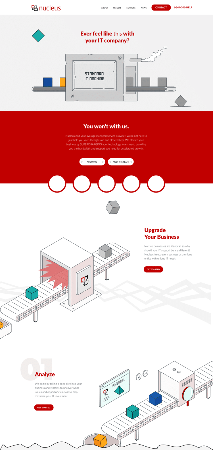
We “flew in” headfirst and decided to go in a completely new direction. Our idea was to capture and elevate their core brand promise of “Supercharging your IT investment” by designing character-driven illustrations and animations that led the user on a journey through their website.

Let’s get super-charged!
Early on in the project we knew that we wanted the site to stand out for more than just great content and a solid user experience. No, we wanted more!
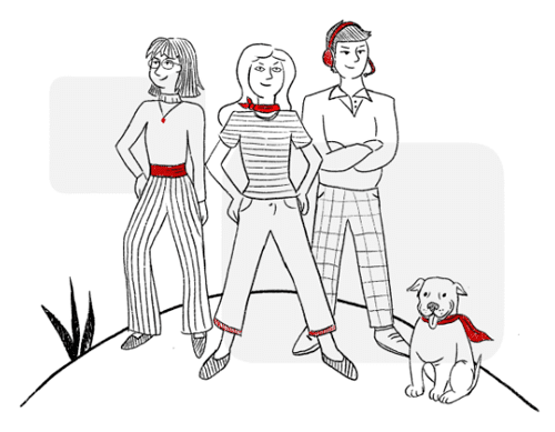
The initial designs included on-page animation, so as we went back to the drawing boards we recognized right away that the concept would lend itself perfectly to showing how Nucleus makes average businesses super. Enter our new Nucleus mascot – super girl!
Throughout the site, animated images accented with the Nucleus red are used to emphasize positive change and growth.
“Your designs are perfect! Thanks so much.”
SAM PARRETT / SALES & MARKETING COORDINATOR
A human-focused theme
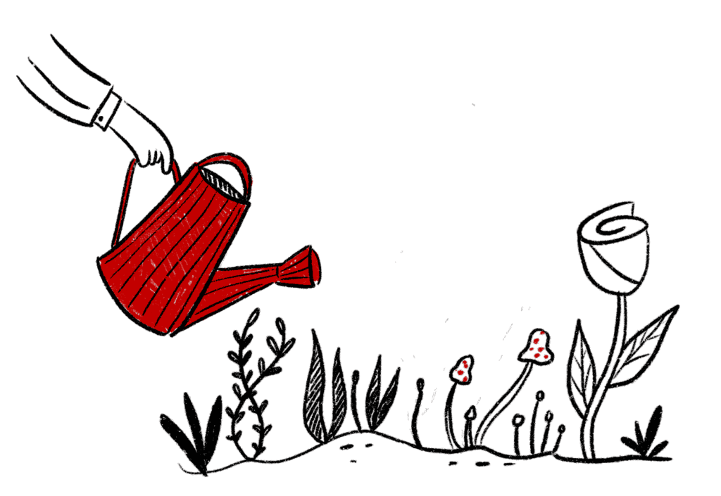
Our hand-drawn illustrations are playful and simple.
We wanted to tell Nucleus’ story in a fun way, highlighting their attributes and unique approach to delivering Managed IT Services.

We focused on using their existing vibrant red as the main colour throughout the site.
Using one main pop of colour gives Nucleus more brand recognition, much like TD green and Facebook blue. It’s bold but never overpowering when paired with the unique black-and-white look and the serif typography. The use of red conveys the “supercharged” component of the image.

We further expressed their personality by inserting Easter eggs into the site.
We included little pockets of humour and surprises, maybe not initially noticeable by the general public, but they’re there if you look hard enough. Some of these include using the company dog Lawrence as the Supercharge mascot and implementing a hover effect on the team page that expresses the individuality of their team members.

Our final word on the new Nucleus branding
We hope the juxtaposition of a tech company using illustrations to relay their message inspires the viewer to be bolder and have more fun when looking at their brand. With current trends moving from “perfect” and more toward imperfect and human, the Nucleus brand is right where it needs to be.


